- Role
- Senior Product Designer
- Services
Product Design
Strategy
Web3 UX
- Timeline
- 8 Weeks
- Tools
- Figma · Adobe CC
Web3 Product Design
Galaxy
- Web3
- Product design
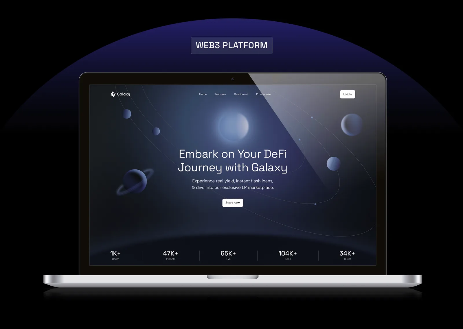
Galaxy is a DeFi platform built for traders who operate on both sides of a token's life — the pre-market window before liquidity exists anywhere else, and the volatile hours right after launch. Most interfaces in this space are built by engineers for engineers: dense, inconsistent, and unforgiving to anyone without a terminal's worth of context.
I was brought in to design the product end-to-end — information architecture, trading flows, and the visual system — with a brief to make a genuinely confusing market structure feel navigable without dumbing it down for the traders who actually live in it.
Trading on inherited complexity
Pre-market DeFi trading has no shared mental model — pricing, liquidity, and risk all behave differently before and after a token goes live, and most platforms just inherit the layout of a standard exchange and hope it holds. It doesn't. Traders were cross-referencing three browser tabs to answer one question: is this safe to enter right now.
One surface, two market states
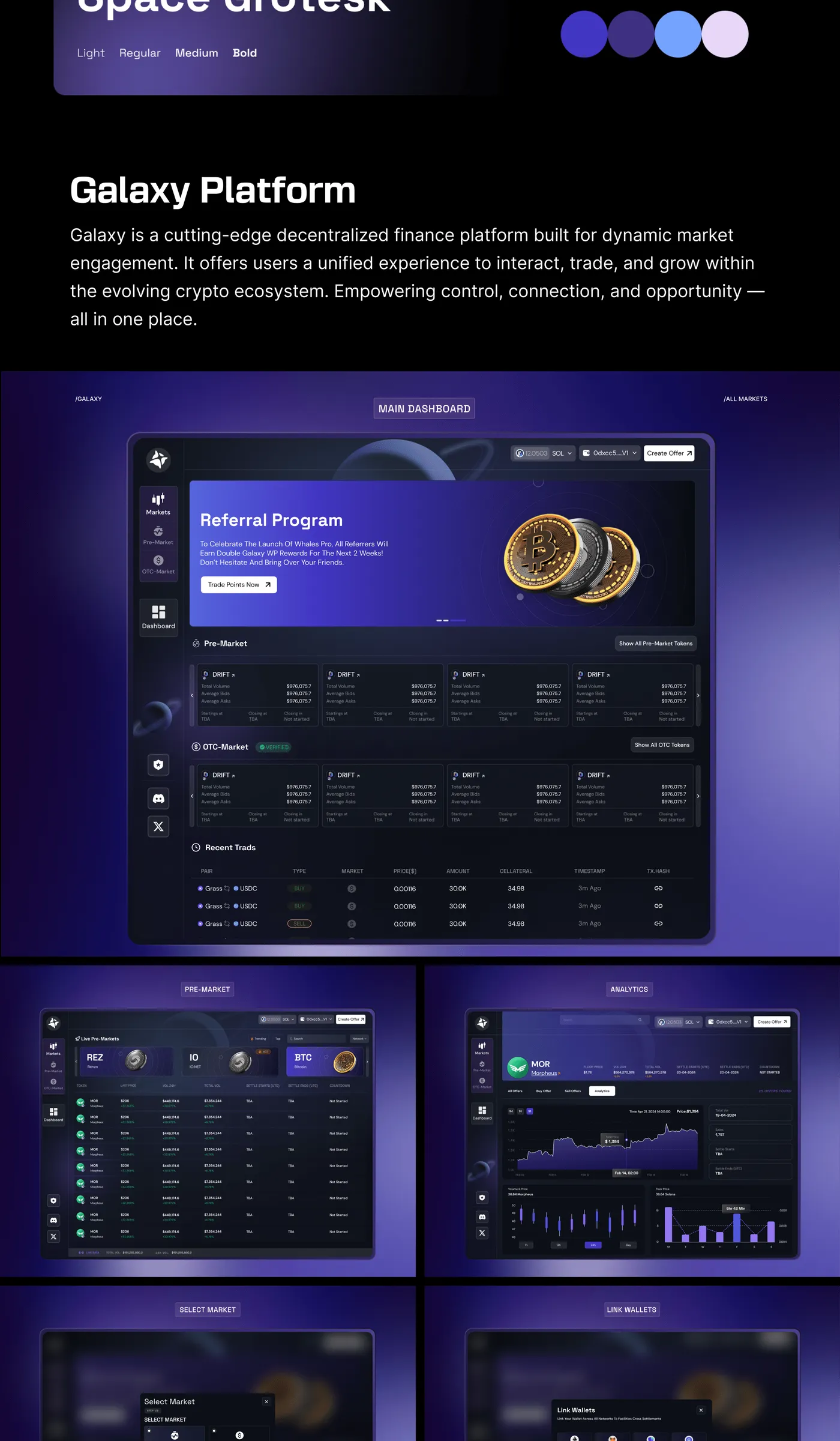
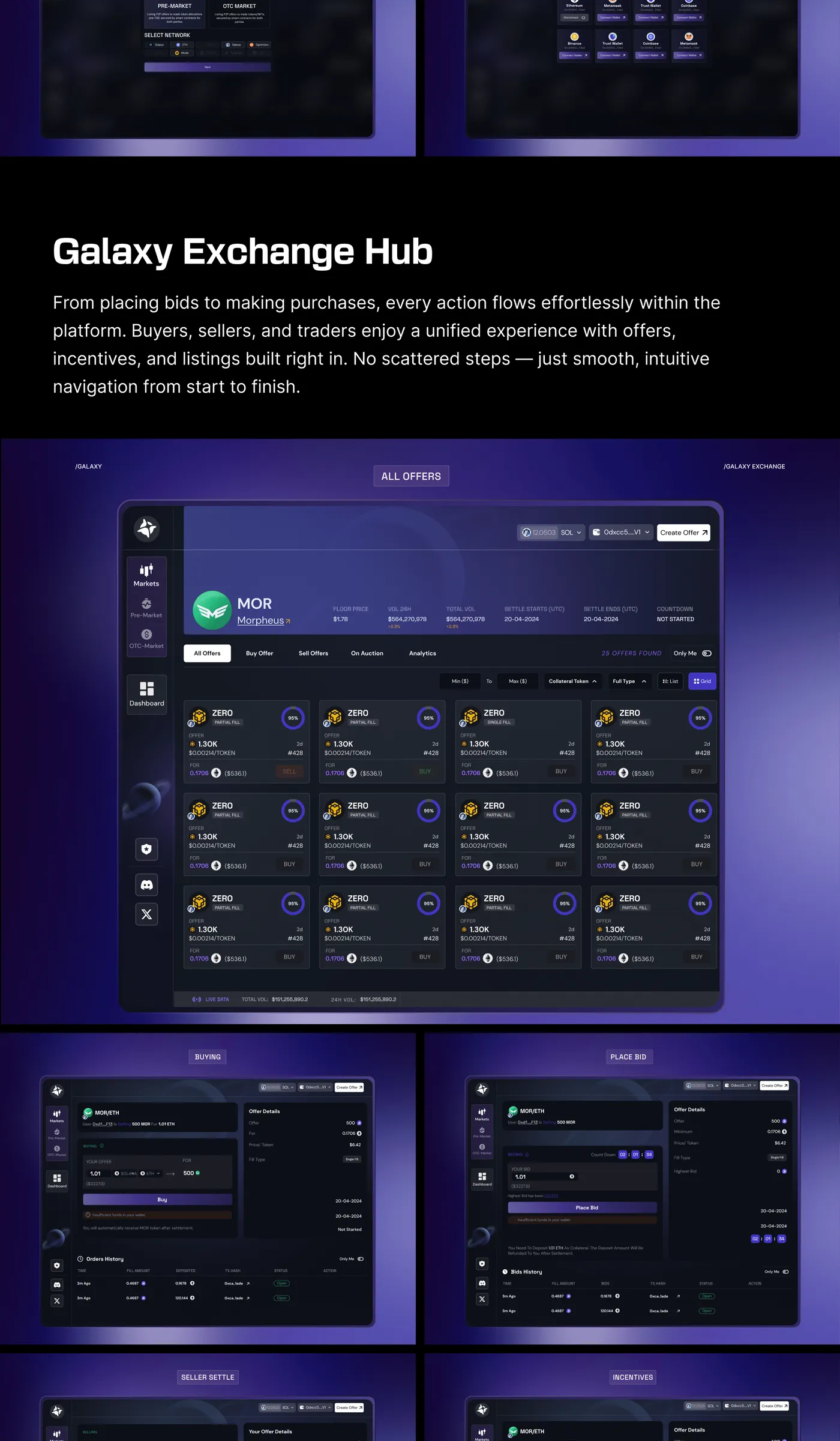
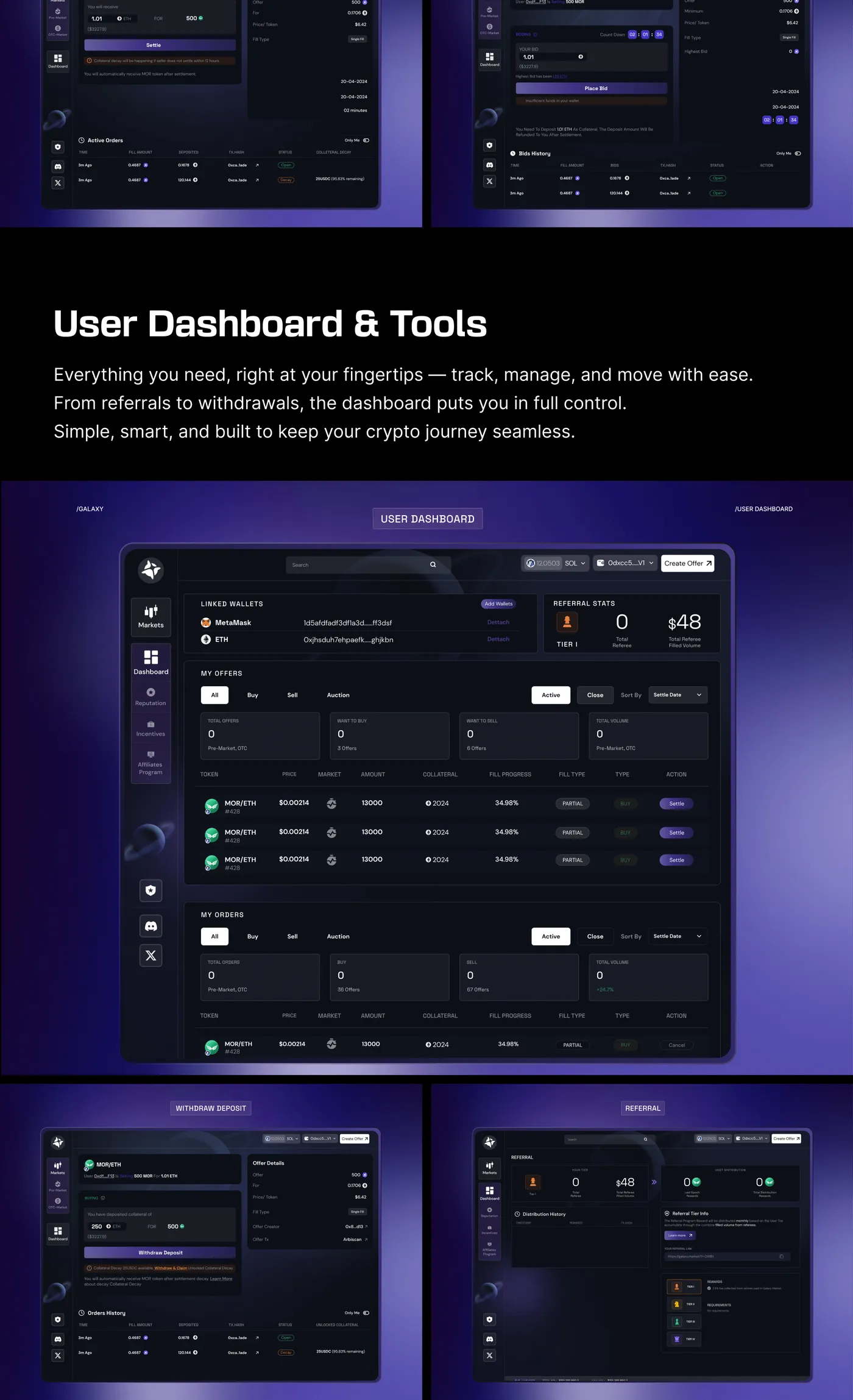
Instead of bolting a pre-market mode onto an existing exchange UI, I designed Galaxy around the state transition itself — one surface that visibly changes character the moment a token crosses from pre- to post-market, so the interface teaches the market structure instead of hiding it.
Reading risk at a glance
Every listing carries a compact risk signature — liquidity depth, contract age, holder concentration — rendered as a single scannable strip instead of a wall of raw numbers. Traders could triage a token in seconds instead of opening a block explorer.
Designing for the handoff moment
The pre-to-post-market transition is when the most money moves and the least attention is available. I built a dedicated transition state — countdown, liquidity unlock, and first-trade price — so traders aren't guessing about what 'live' actually means.
Trading without losing context
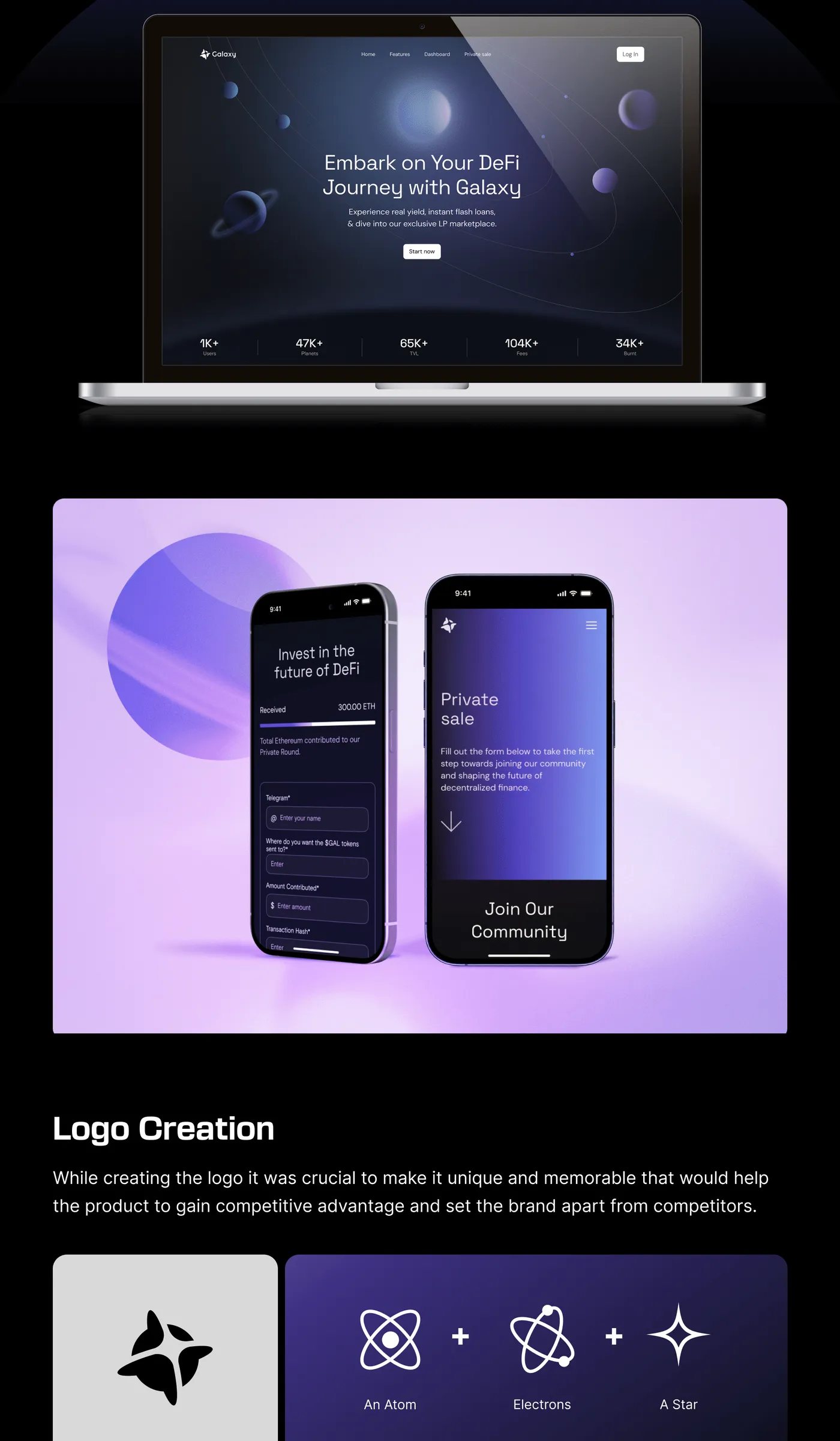
Order entry sits in a persistent side panel rather than a modal, so traders can place and adjust positions without ever losing sight of the chart that justified the trade.
Full case study
Shipping a platform traders could reason about
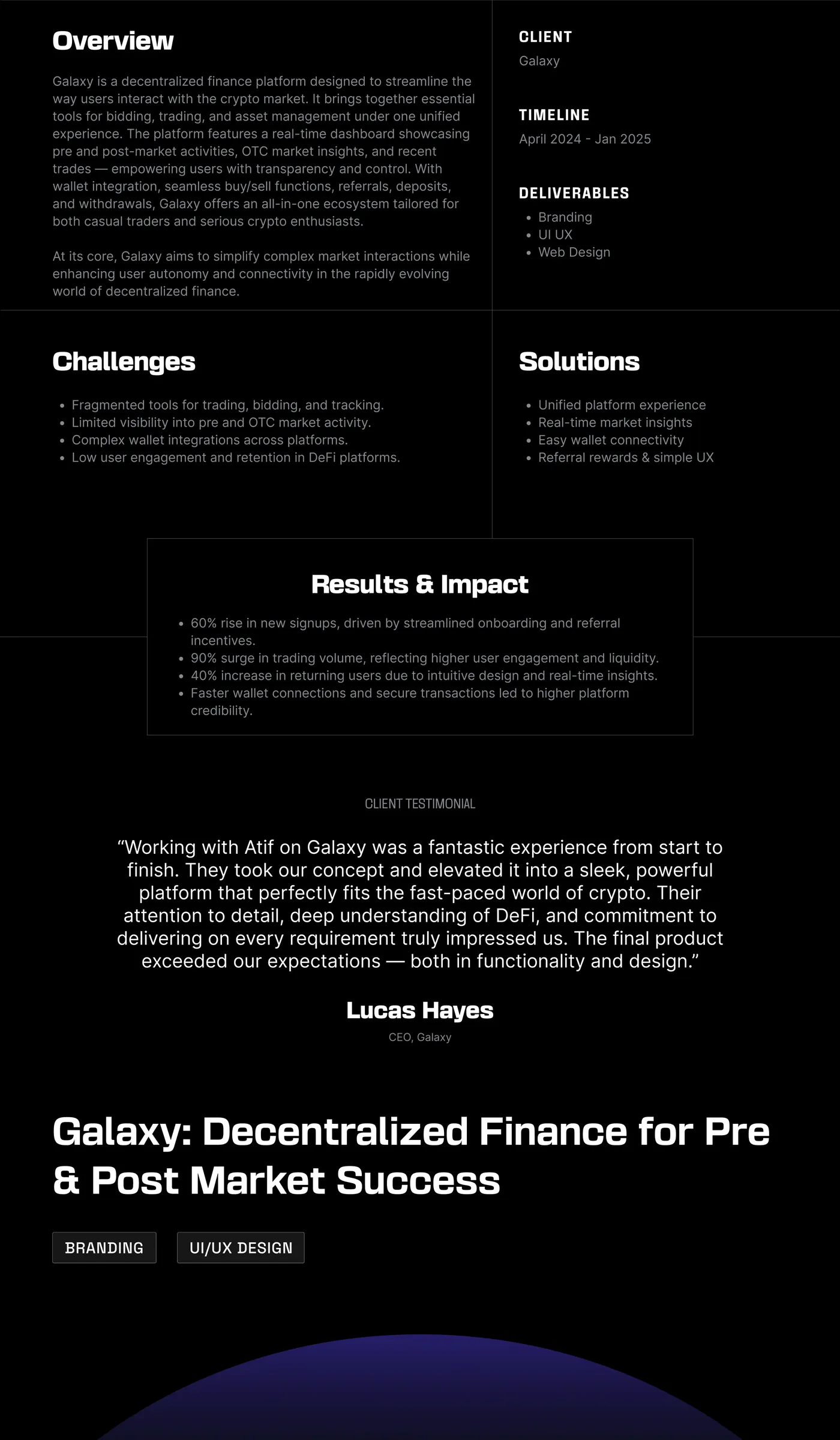
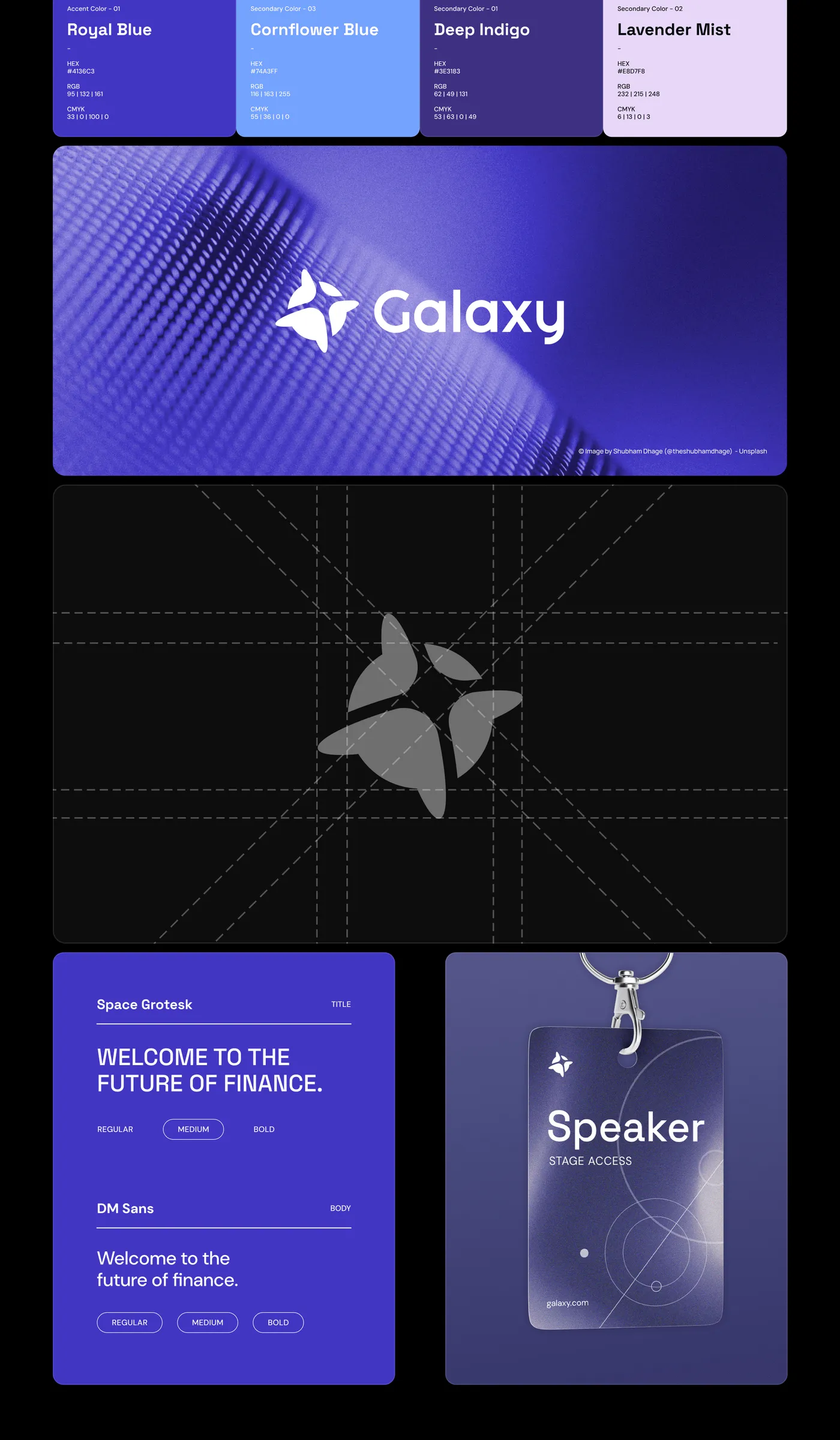
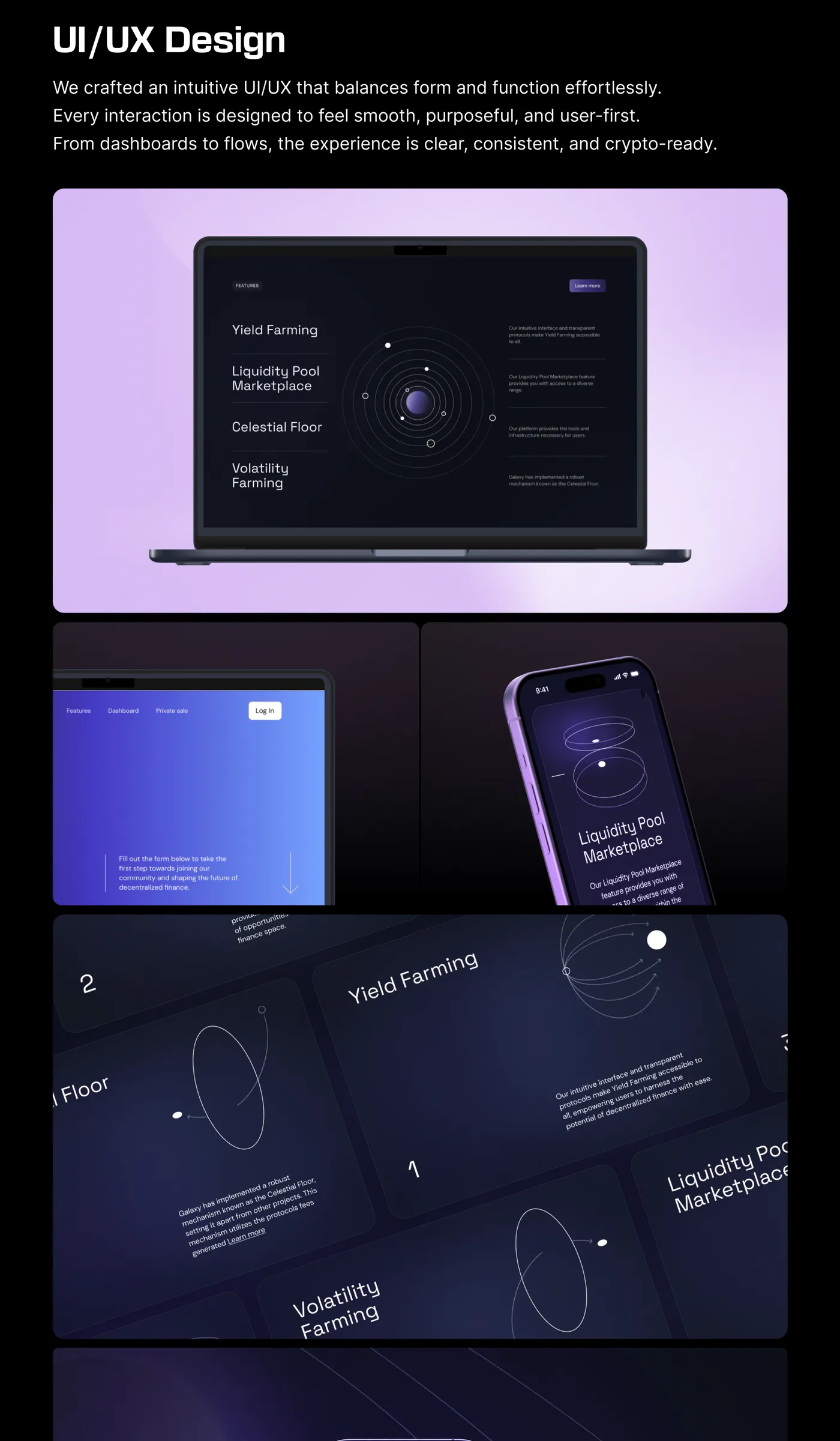
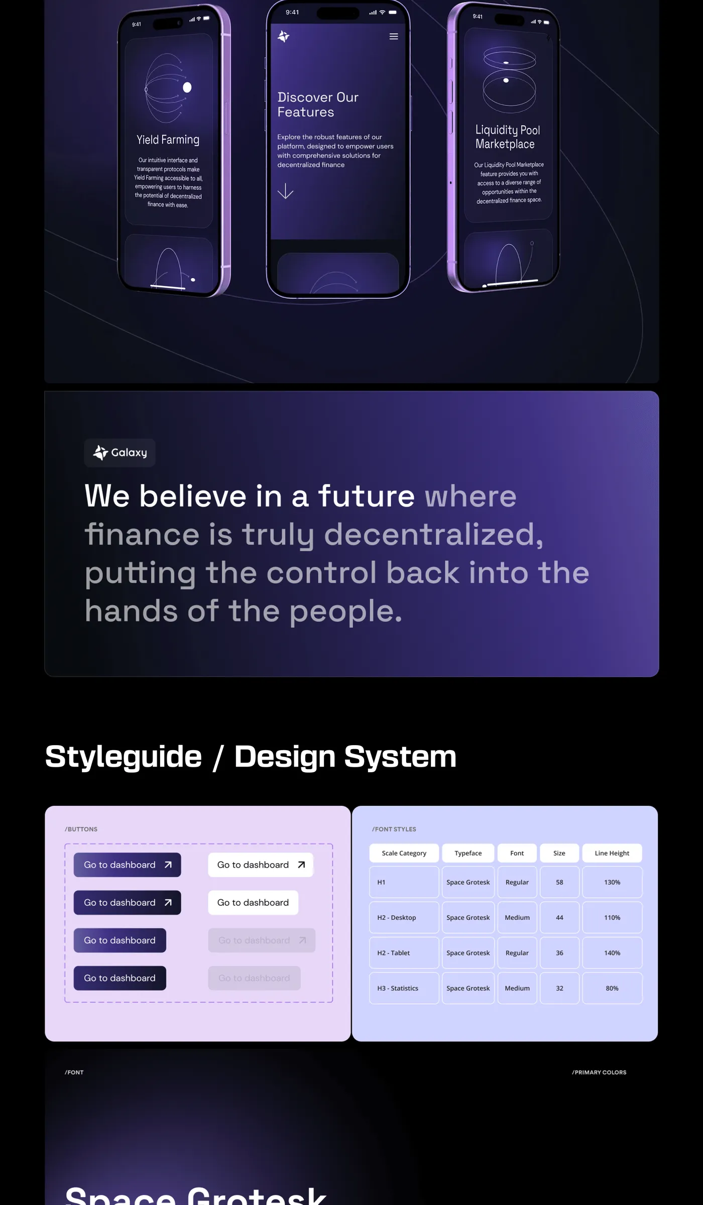
Galaxy launched with a UI that treated market structure as the design problem, not an afterthought — built so the interface explains the market it's showing, instead of asking traders to already know it.
- 40+ screens trading flows, risk states & onboarding designed solo
- 2 market regimes pre- and post-market, unified into one system
- 8 weeks from brief to shipped v1
Up Next
Solar Website Redesign