- Client
- Healthcare Solutions
- Year
- 2023 — 2024
- Role
- Senior Product Designer
- Services
Product Design
Strategy
Branding
- Timeline
- 8 Weeks
- Tools
- Figma · Adobe CC
Healthcare · Design System
Healthcare Management
- Design System
- Healthcare
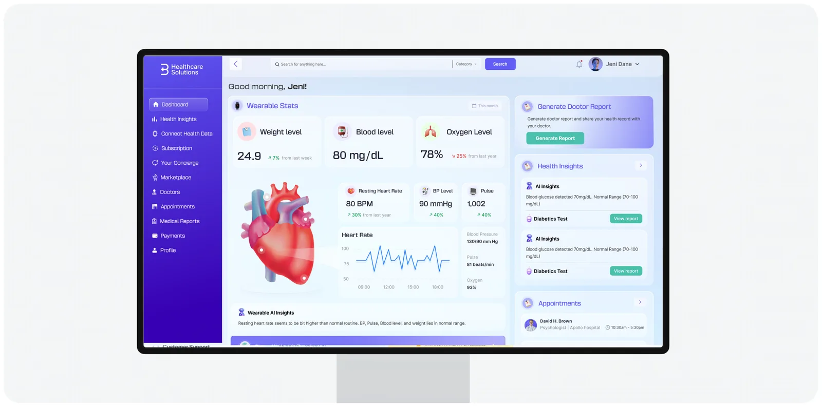
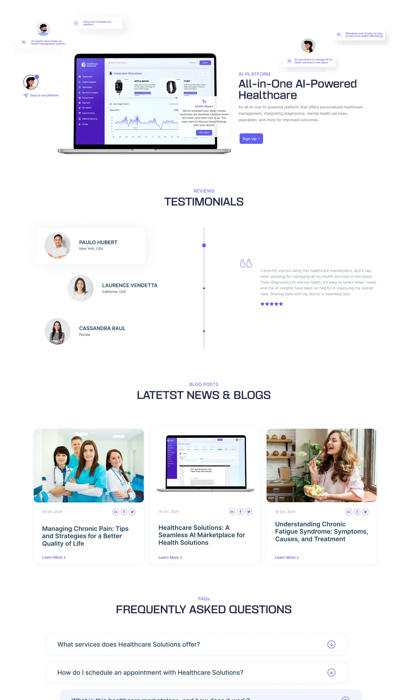
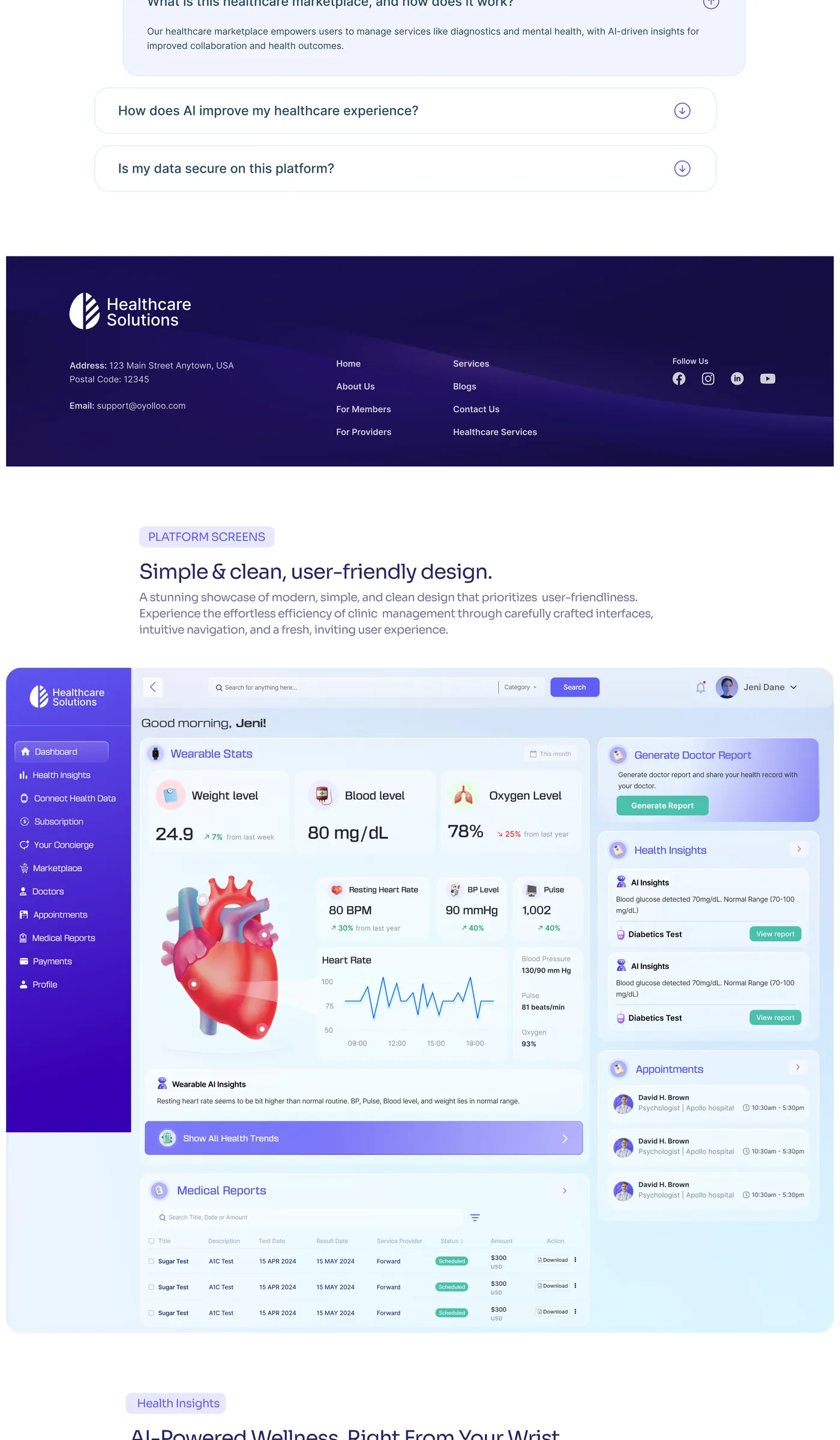
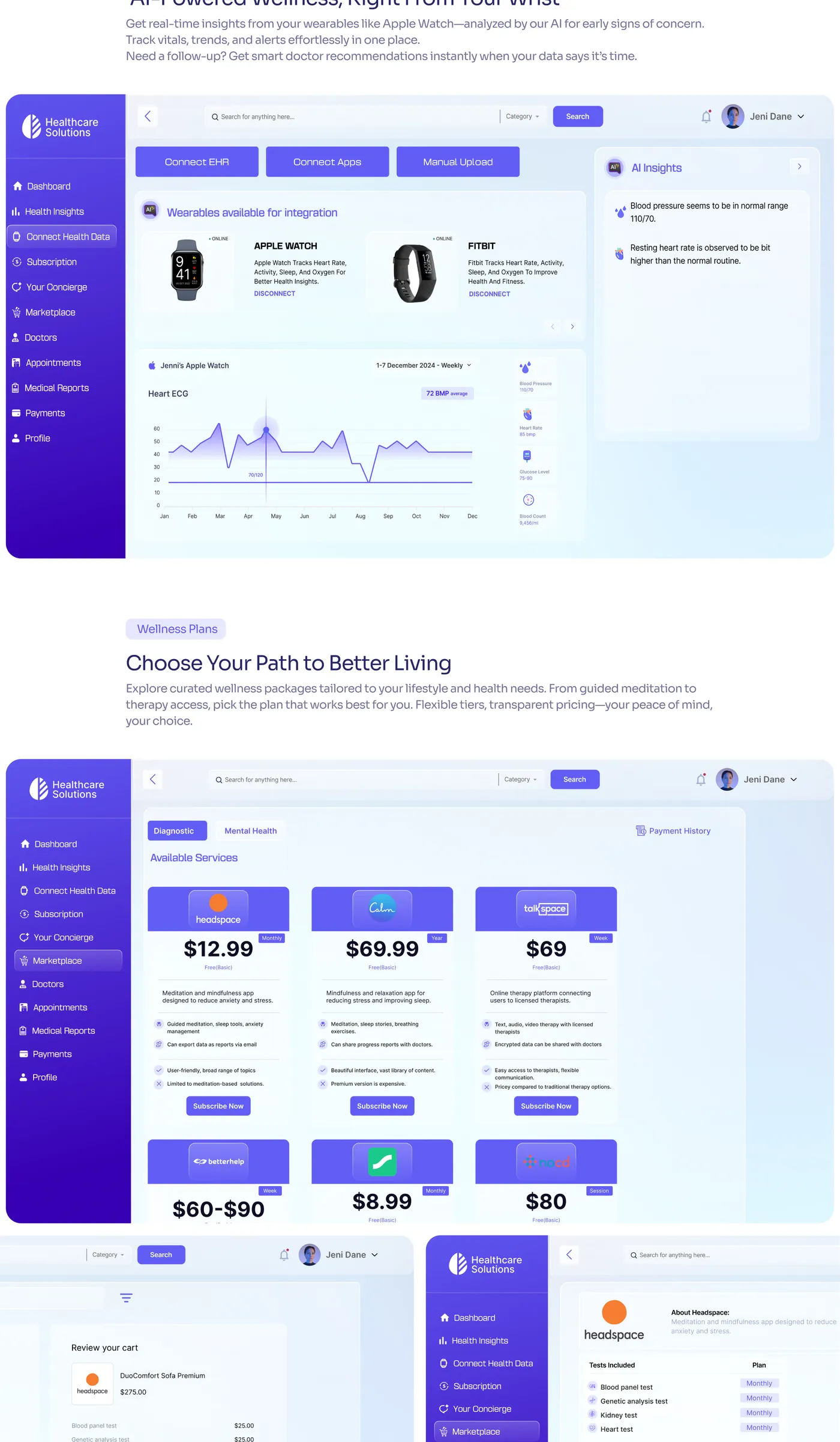
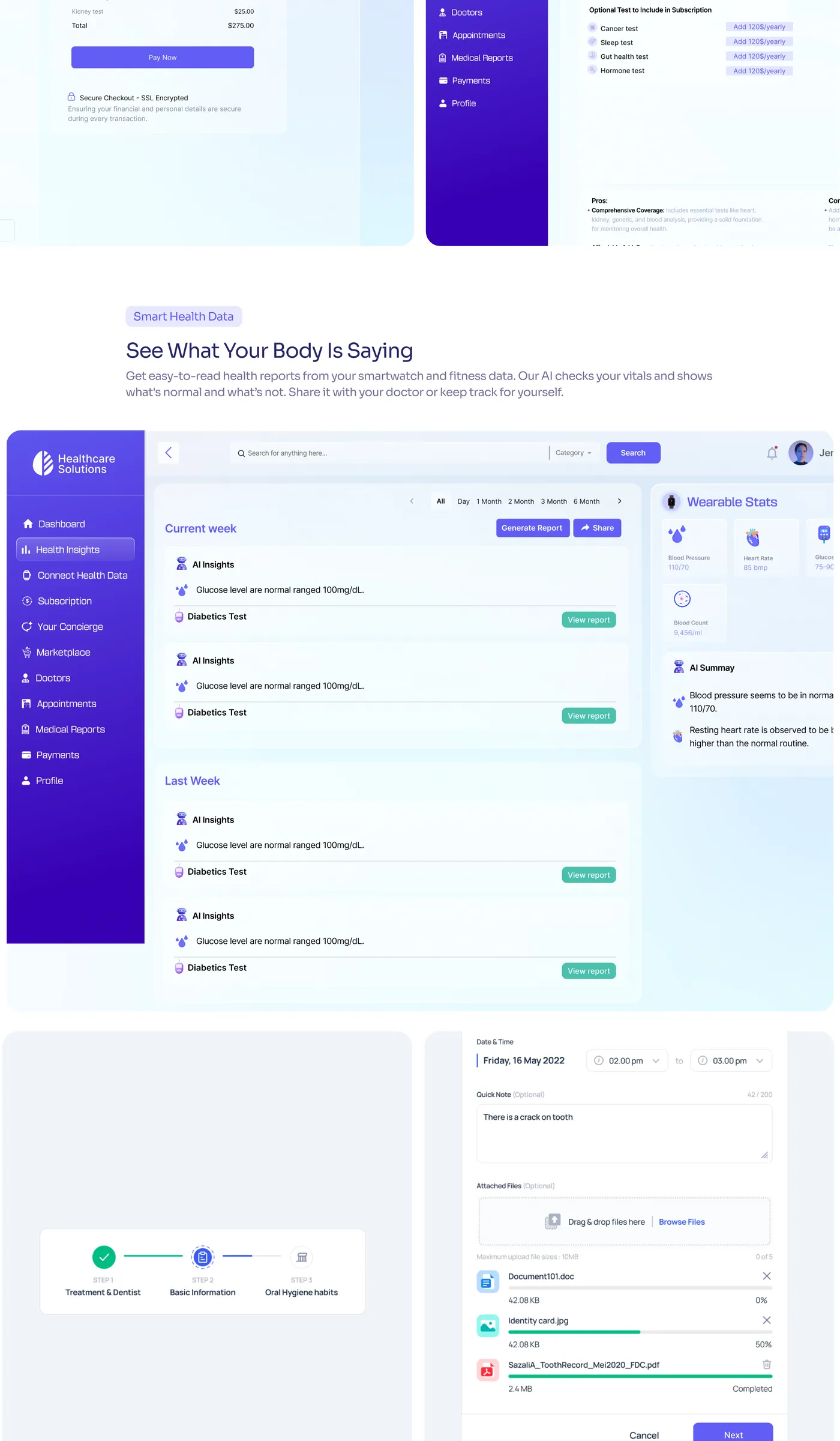
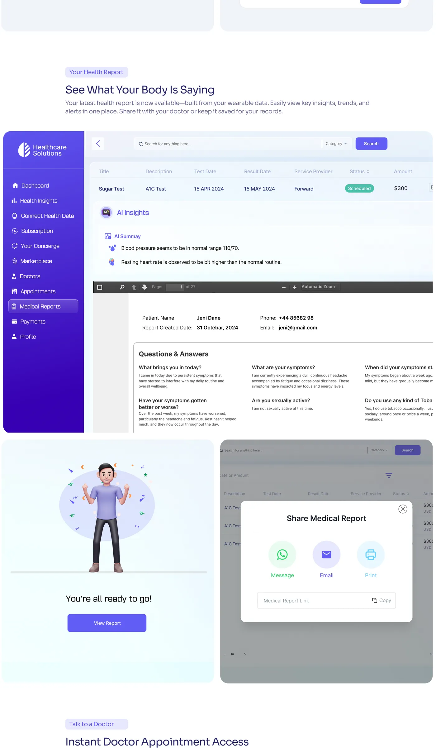
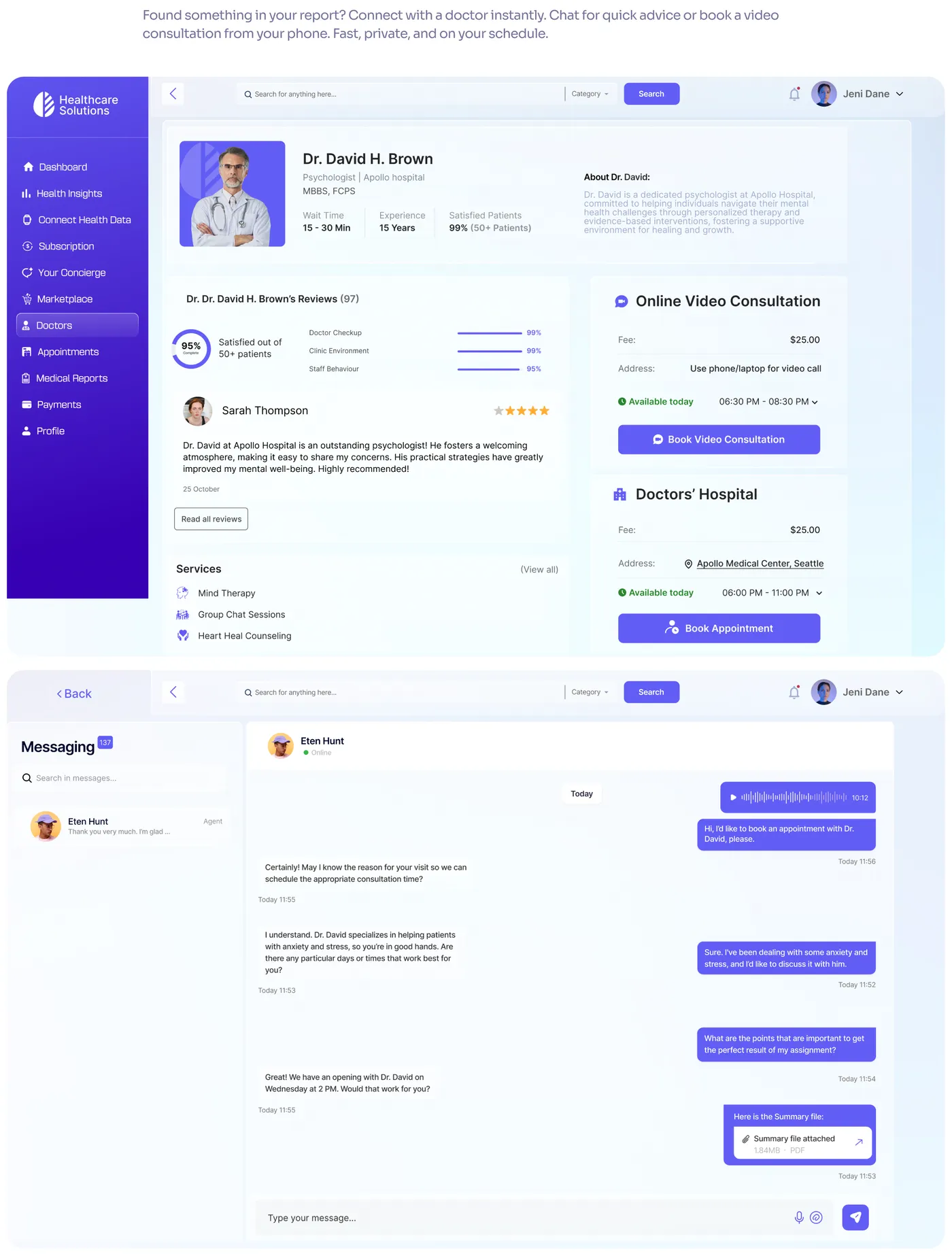
Healthcare Management is a design system built for the administrative and clinical staff running a healthcare platform day to day — scheduling, records, and care coordination — rather than for the patient-facing side most healthcare design work focuses on.
I was responsible for the design system itself: component architecture, states, and documentation, built so a team under constant feature pressure could ship consistent, safe interfaces without re-solving the same interaction problem in every new screen.
Every team solving the same problem differently
Three different squads had each built their own version of a patient-search table, a status badge, and a scheduling conflict warning — functionally similar, visually inconsistent, and each one a fresh source of bugs. Nobody had time to stop and reconcile them, so the inconsistency compounded release over release.
A system that encodes the edge cases, not just the happy path
I treated every component as a small model of real clinical behavior — what a record looks like when it's incomplete, overdue, or conflicting with another appointment — so engineers inherited the correct edge-case handling by default instead of guessing at it per feature.
Naming the states nobody wants to design
Every data-heavy component shipped with explicit empty, loading, partial, and conflict states — the ones usually skipped under deadline pressure — because in a healthcare context a silently wrong empty state is a safety issue, not a cosmetic one.
Configuring for flexibility without chaos
Scheduling and record components were built with constrained configuration options — enough flexibility for different care teams' workflows, not so much that two teams could reinvent the same screen two different ways.
Documentation engineers actually opened
Each component shipped with usage rules and do/don't examples pulled from real screens already in production, so adoption didn't depend on a single design system evangelist chasing teams down.
Full case study
Consistency as a safety feature
The system gave clinical and admin tools a shared visual and behavioral language, closing the gap between squads and reducing the number of one-off interaction patterns new engineers had to learn before touching a screen.
- 8 weeks from audit to documented v1 system
- 30+ components specified with full state coverage
- 3 squads aligned onto one shared system
Up Next
Galaxy