- Client
- Makan
- Role
- Senior Product Designer
- Services
Product Design
Strategy
Branding
Bilingual Platform
- Timeline
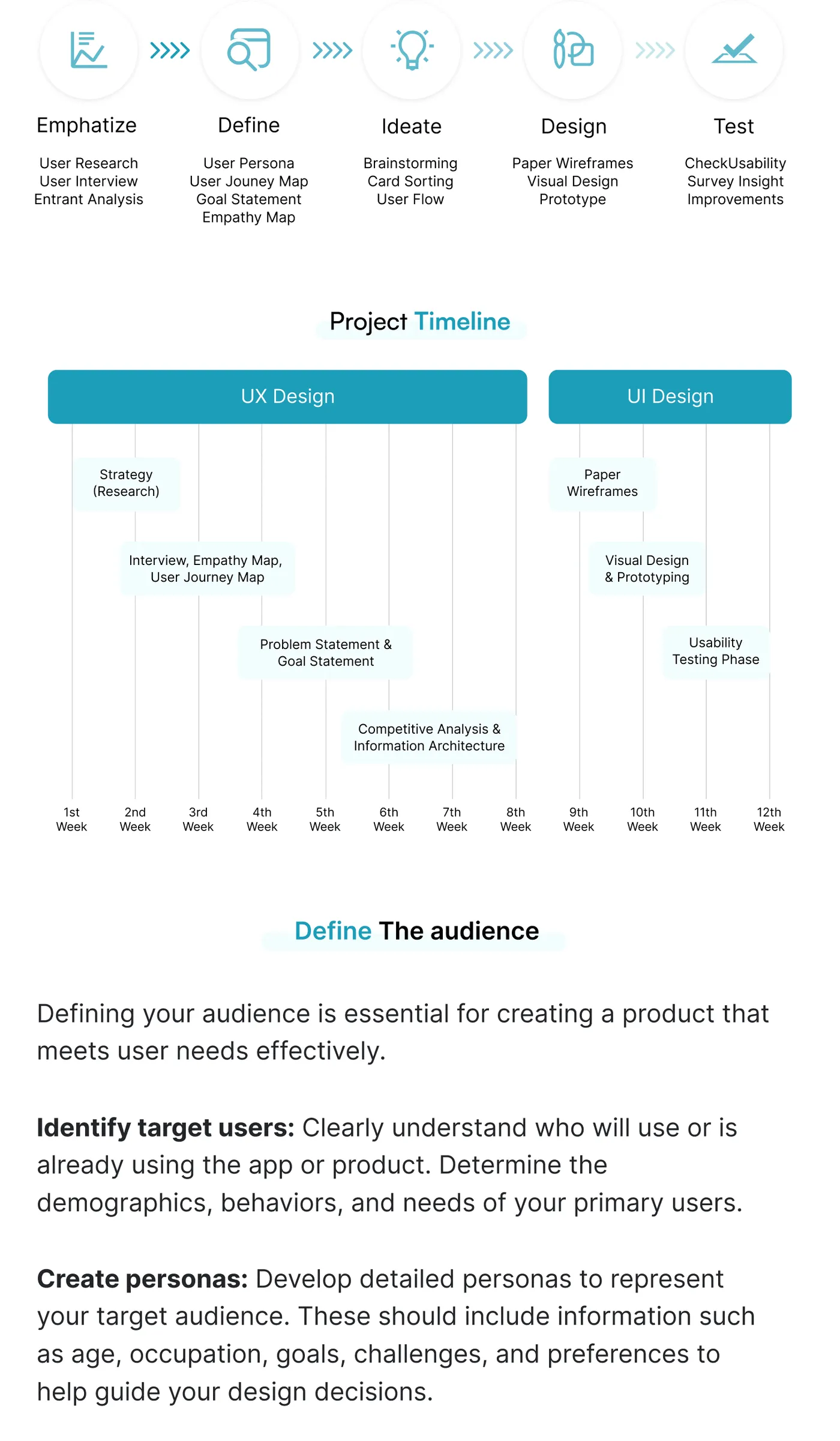
- 12 Weeks
- Tools
- Figma · Adobe CC
Urban Mobility
Parking
- Urban mobility
- Product design
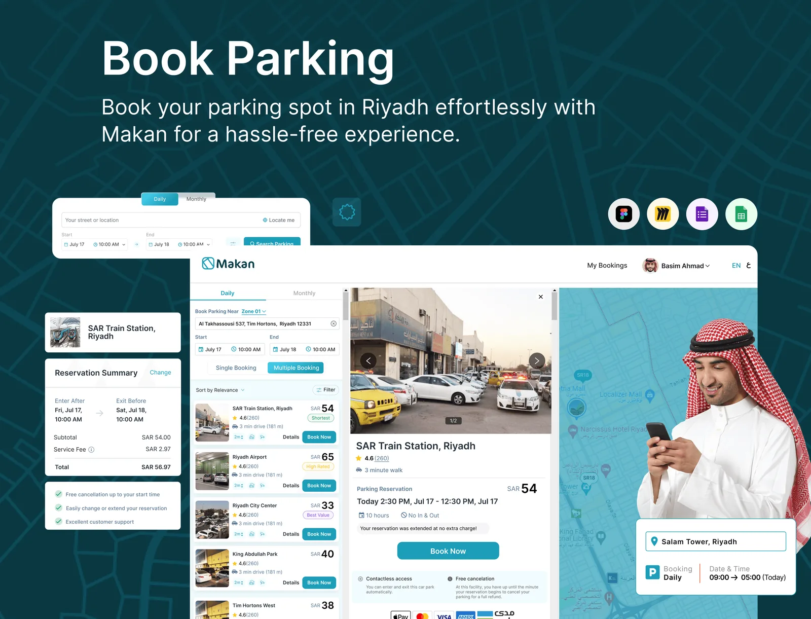
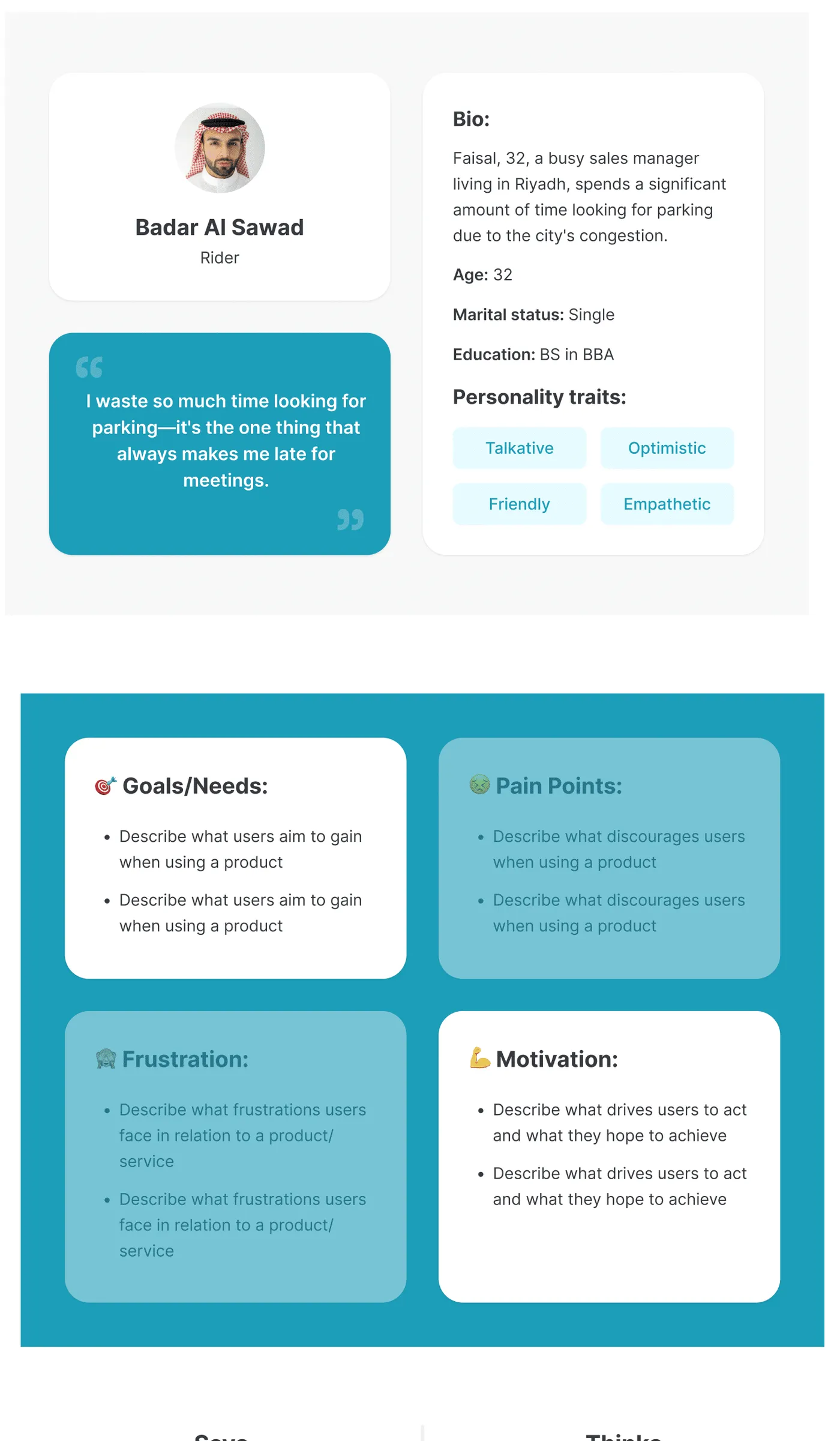
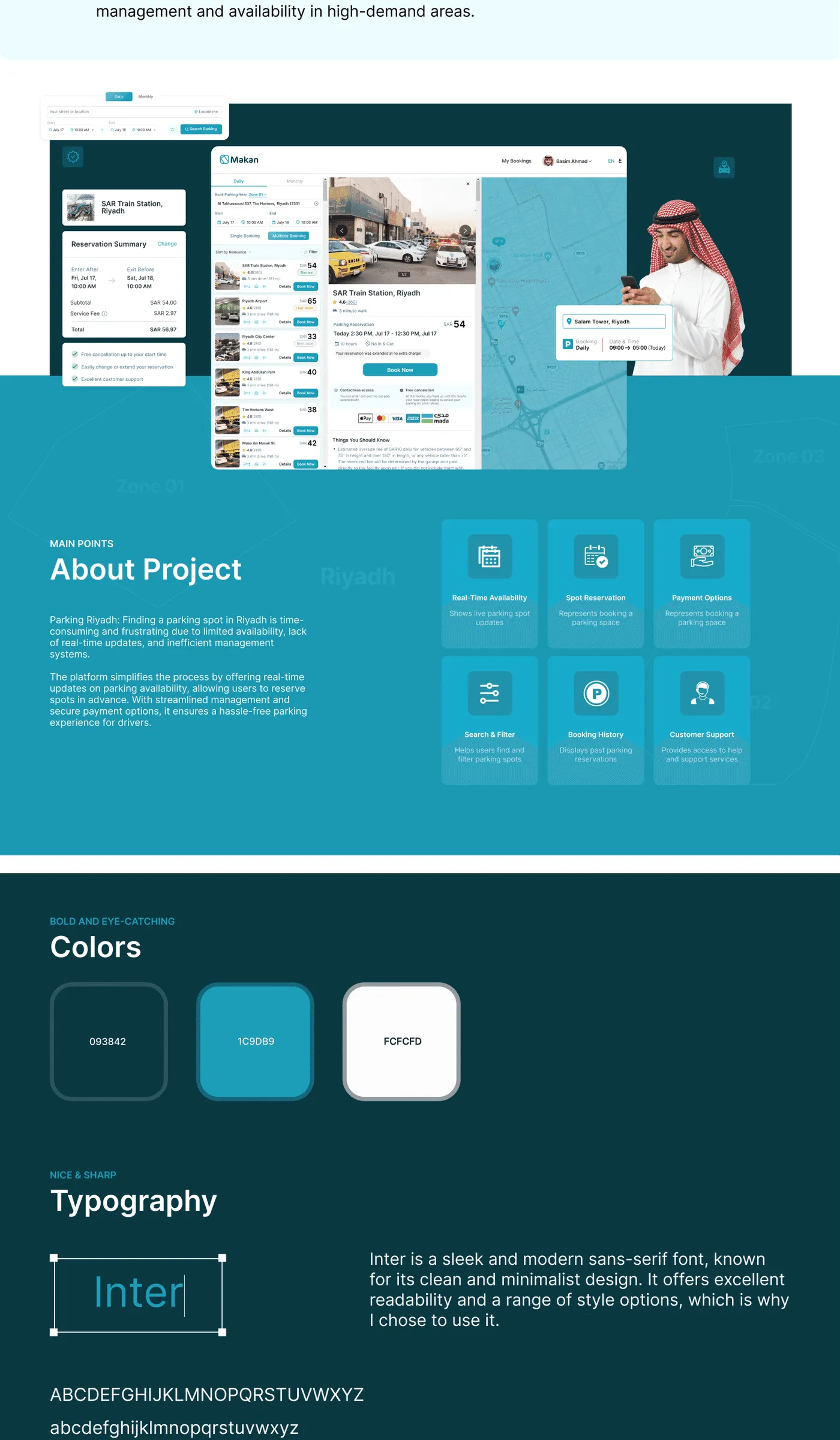
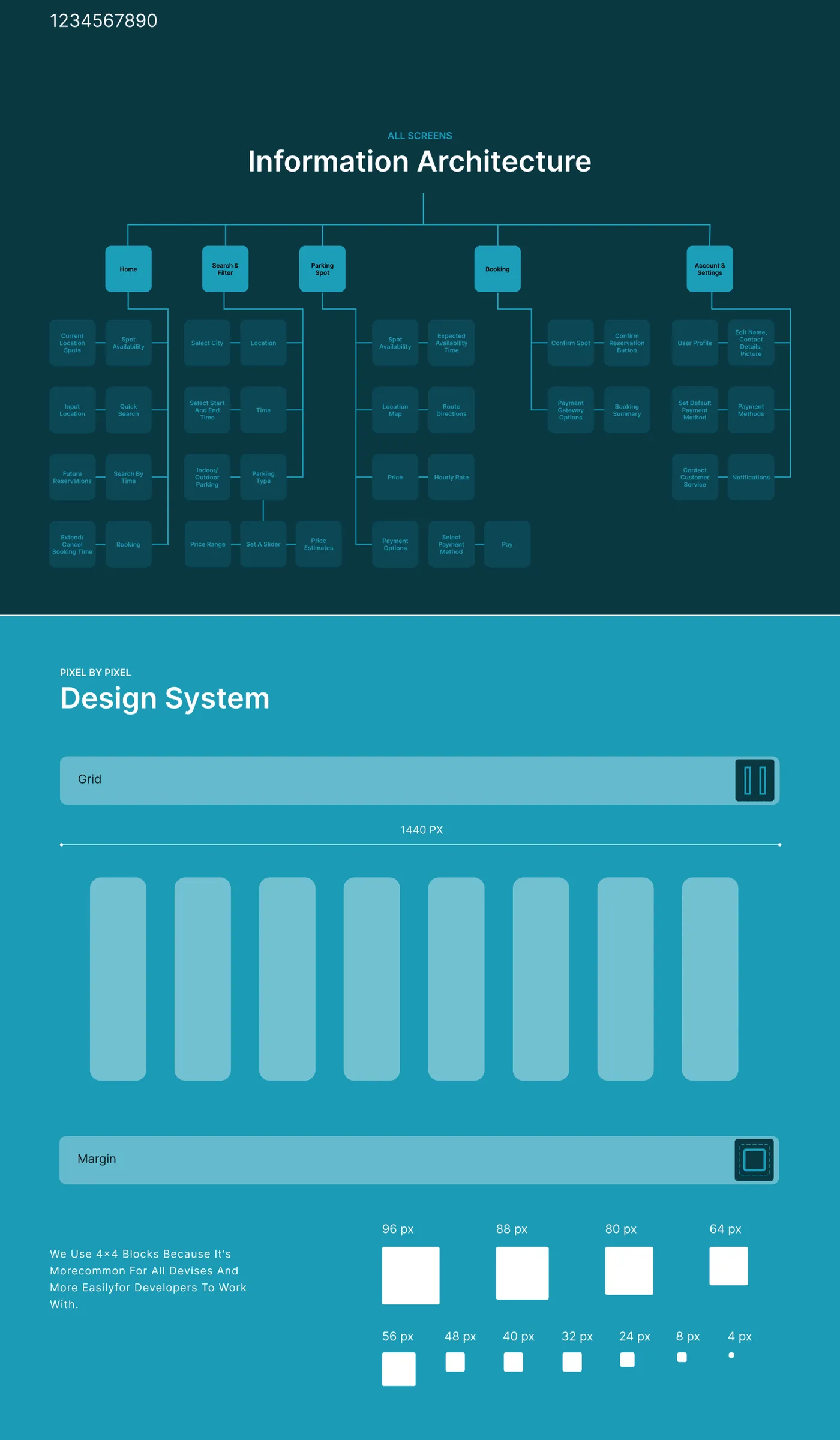
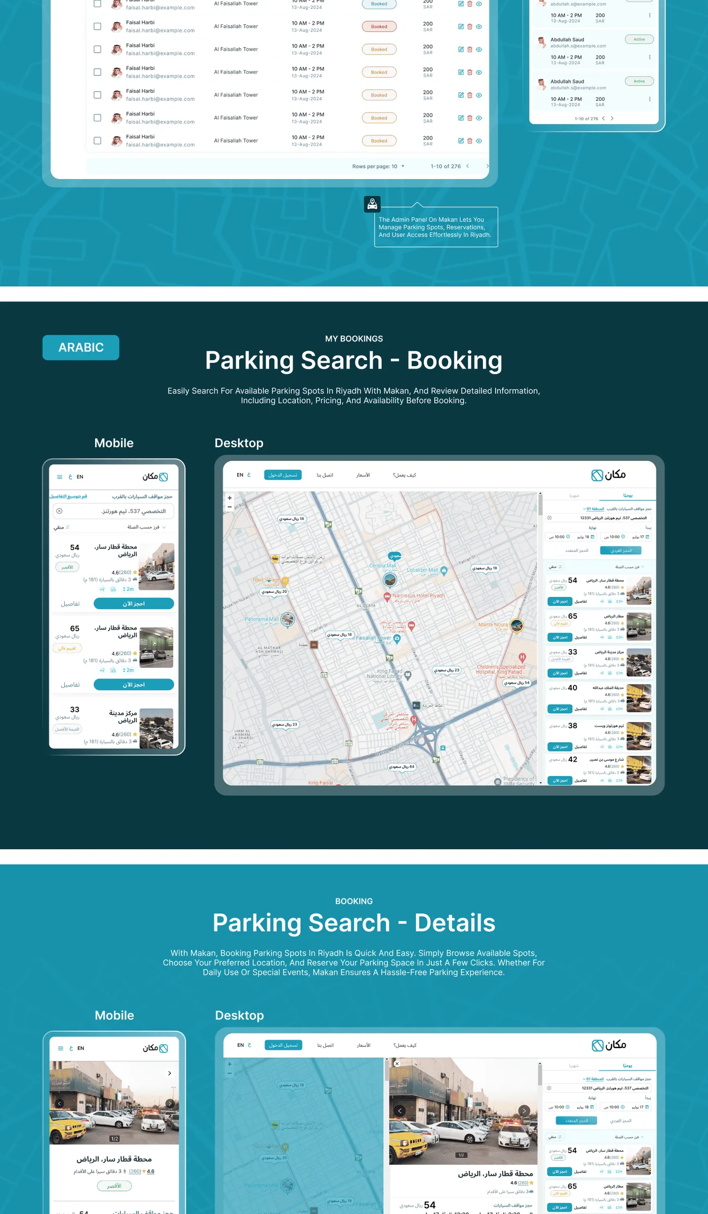
Parking is a mobility product for finding, reserving, and paying for parking across a city where signage, pricing, and enforcement rules change block by block — and where every screen has to work equally well in English and Arabic.
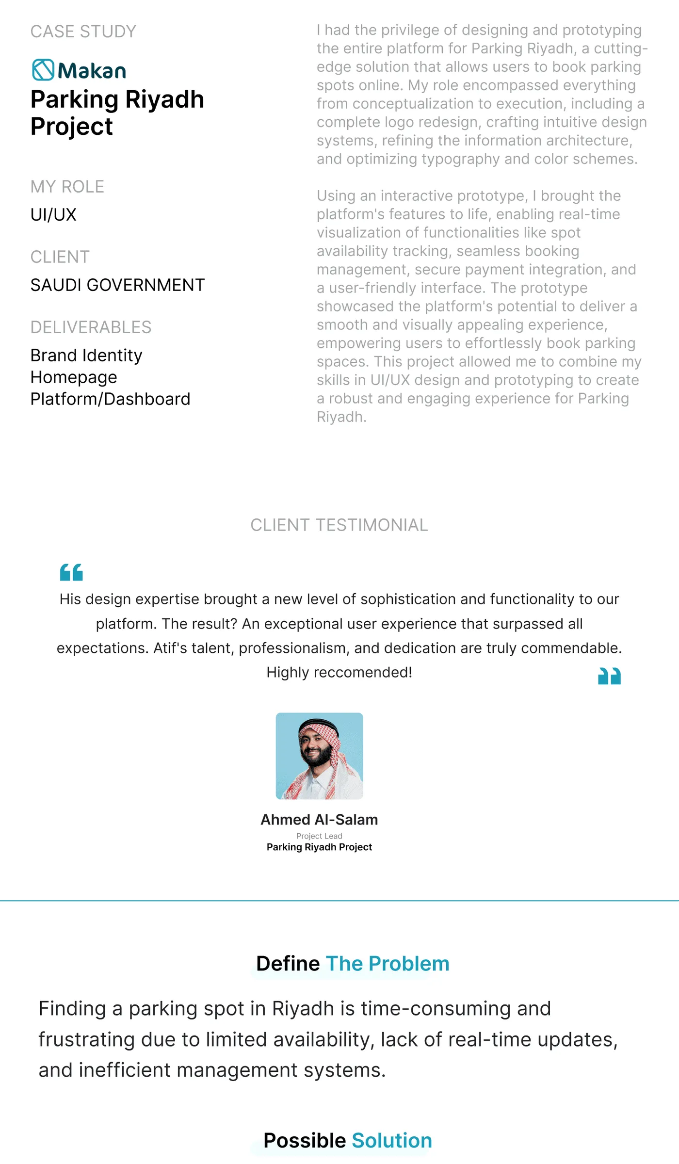
I led product design and brand strategy end-to-end: research, IA, the full bilingual UI, and a visual identity that had to feel official enough to trust with a parking fine, and simple enough to use one-handed at a meter.
Trust, at the exact moment of a fine
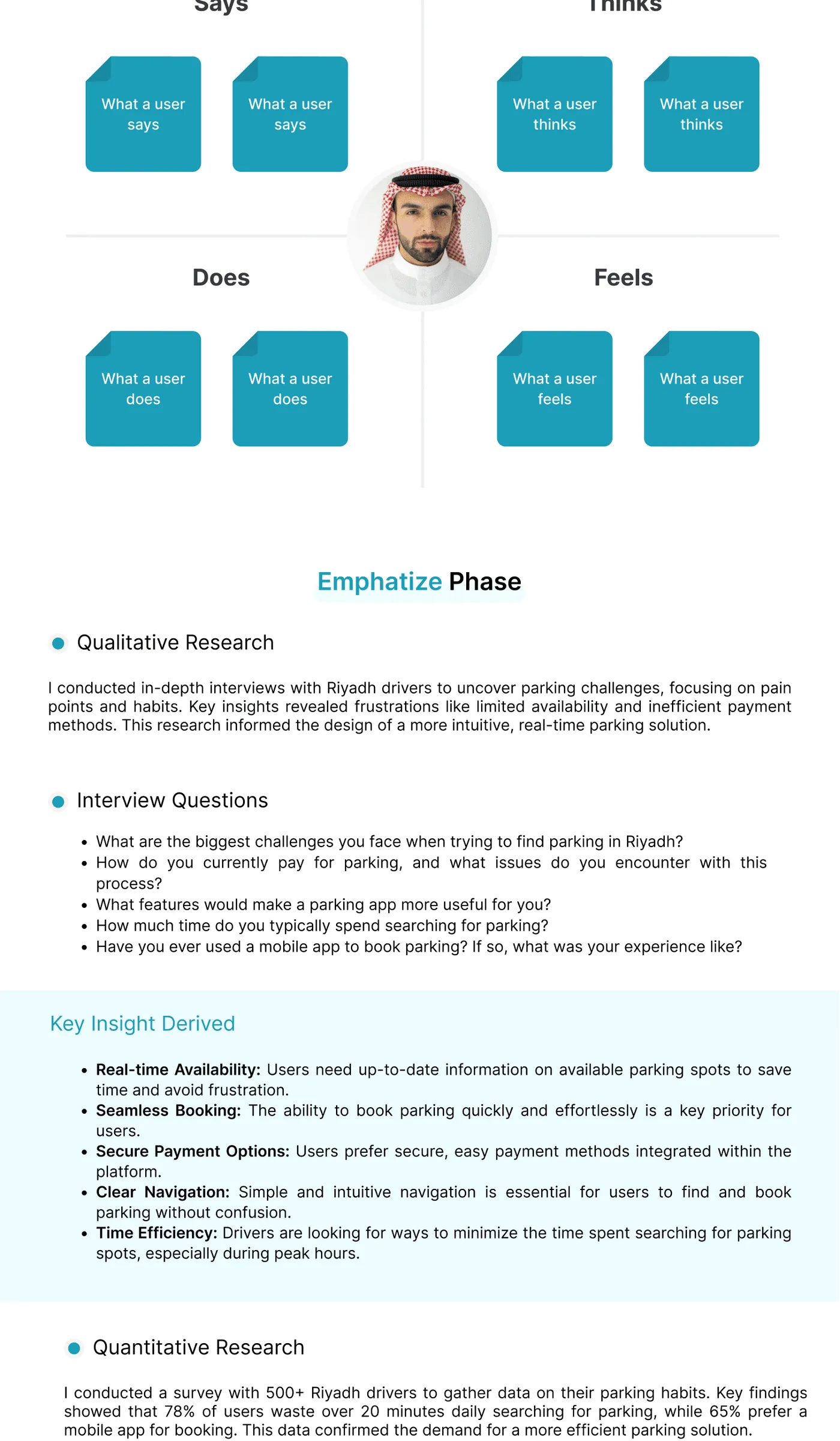
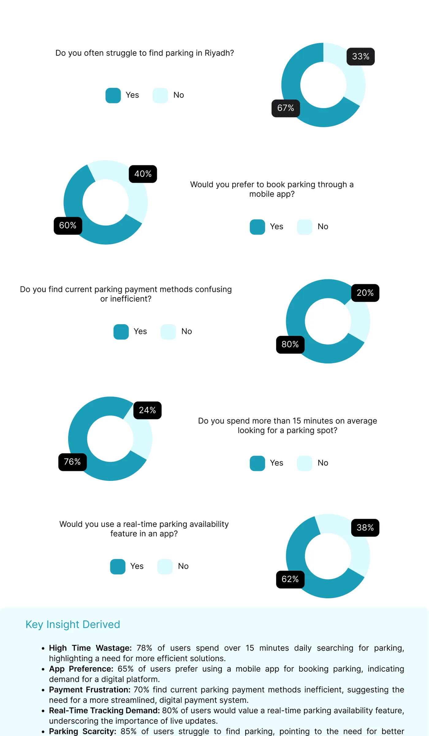
People don't open a parking app when they're relaxed — they open it circling a block, running late, worried about a ticket. The existing experience buried rates and rules in text-heavy screens, and running two full languages through every flow doubled the chance of something breaking or reading as an afterthought translation.
Designing bilingual as a first-class constraint
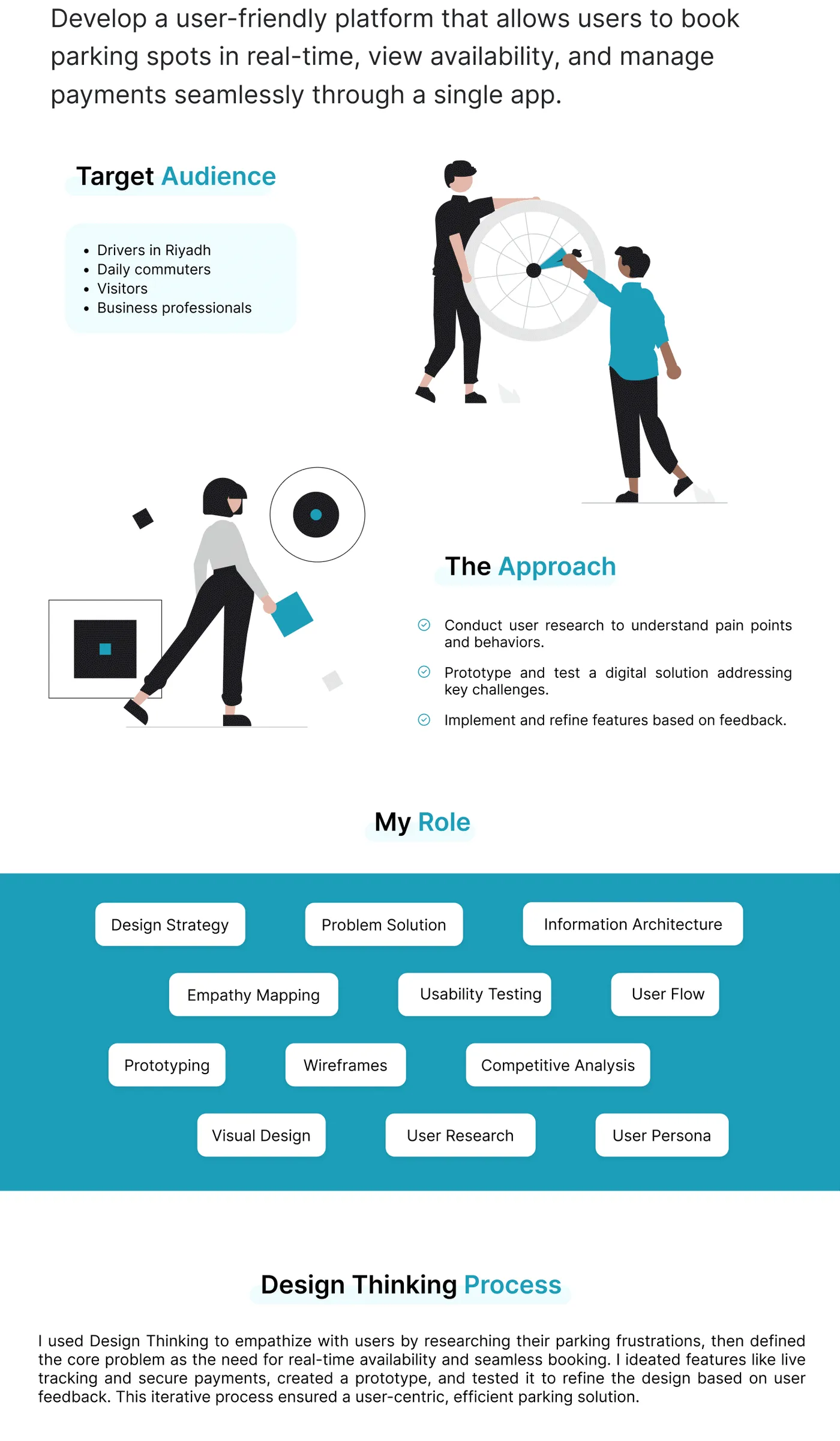
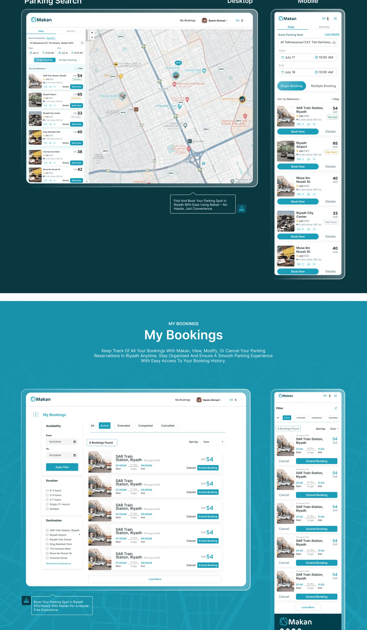
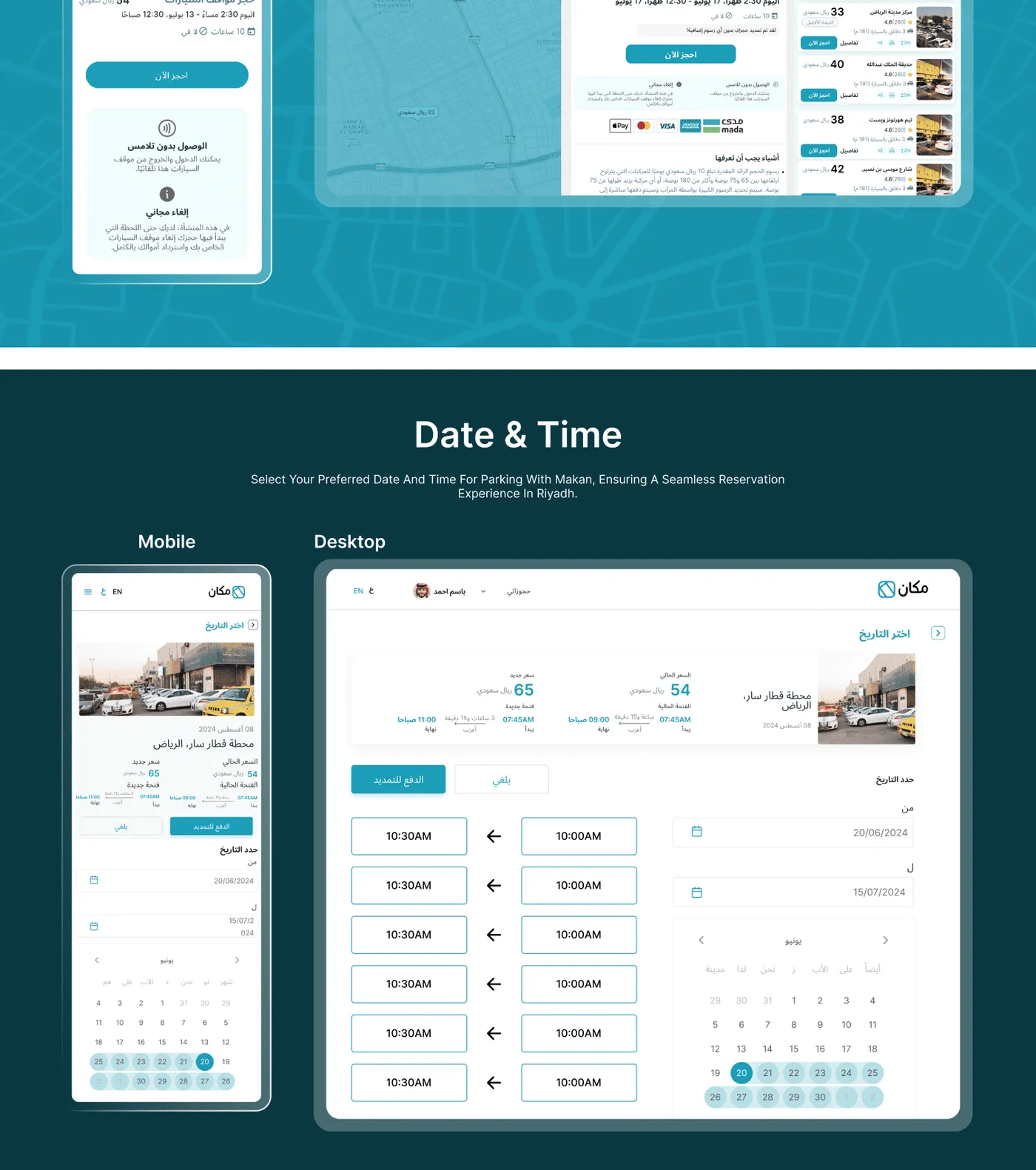
Rather than translate an English-first design after the fact, I built the UI around whichever language ran longer at every breakpoint, so neither language ever felt like the 'real' version and the other a cramped afterthought.
Finding a spot without reading a paragraph
Rate and time-limit information was redesigned as a glanceable badge system — color and icon first, legal text second — so a driver could confirm 'can I park here right now' in under two seconds.
Paying before the meter runs out
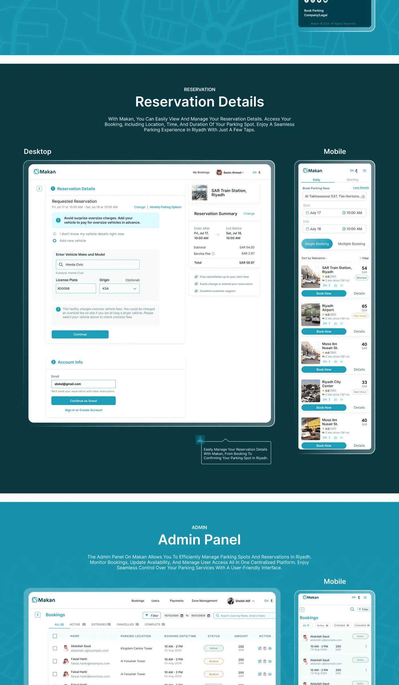
Payment and session extension were collapsed into a single persistent action, reachable from anywhere in three taps, because the cost of friction here is a literal fine.
A visual identity built for two languages
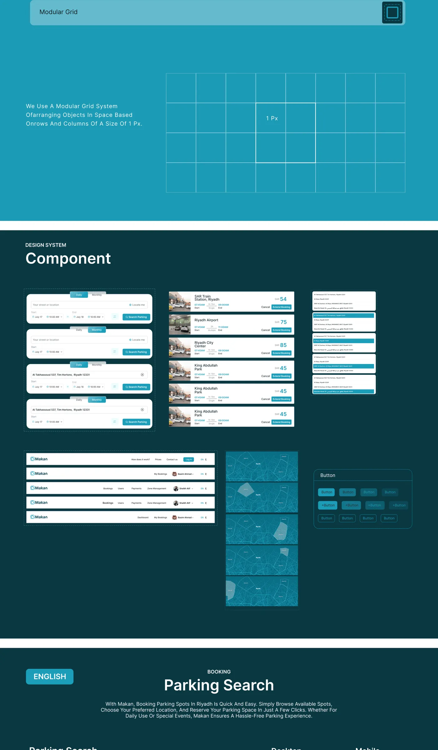
I developed the brand system — mark, color, and type pairing — to hold up at meter-sticker size and inside a native app alike, in both languages, without re-kerning every asset twice.
Full case study
A civic utility that doesn't feel like one
Parking shipped as a bilingual product that reads as considered rather than translated — built to be trusted at the one moment it actually matters, meter running.
- 12 weeks research through final UI delivery
- 2 languages designed as equals from the first wireframe
- 60+ screens across app, payment, and brand system
Up Next
Healthcare Management